
Designing a Responsive Website
May 2025
For my second project as part of my Google UX Design Professional Certificate, I designed a responsive website. This website was inspired by my first project and uses the same art museum I designed an app for.
my prompt
Like previously, my prompt was as follows:
"Design an app and a responsive website for a public art museum to advertise exhibitions and events, provide museum information to patrons and enable patrons to schedule visits"
This project addressed the second part, focusing on responsive web design.
My goals for this project were to:
Develop a stronger understanding of responsive web design and how to create layouts that adapt effectively across multiple screen sizes
Learn how to organise large volumes of content (e.g. through a sitemap) in a way that is intuitive and user-friendly
Strengthen my design decision-making skills by testing ideas, receiving feedback and iterating based on user needs
research
empathise and define
I referred to the same user personas as my first project, which can be seen here. This felt applicable as my questions were based on how individuals plan museum visits and the problems they encounter. In the context of responsive web design, I altered my goal statement to the following:
The Herne Hill Art Museum website will provide sufficient information on exhibitions to let users plan museum visits they will be content with, whilst being accessible through different devices.
We will measure effectiveness by analysing exhibition attendance and reviews.
Competitive audit
To gather an idea of what features were essential to an art museum's website, I carried out a brief competitive audit. This activity also allowed me to discover useful and valuable features I could implement in my website as well as clarify problem areas I could focus on avoiding.
Main findings:
Many websites are multifunctional, serving as both a place for visitors to purchase tickets and access educational resources on art such as archives
Ticket availability information for specific dates or time slots is provided, however, this information is somewhat limited and not very accessible
ideate
paper and digital wireframes
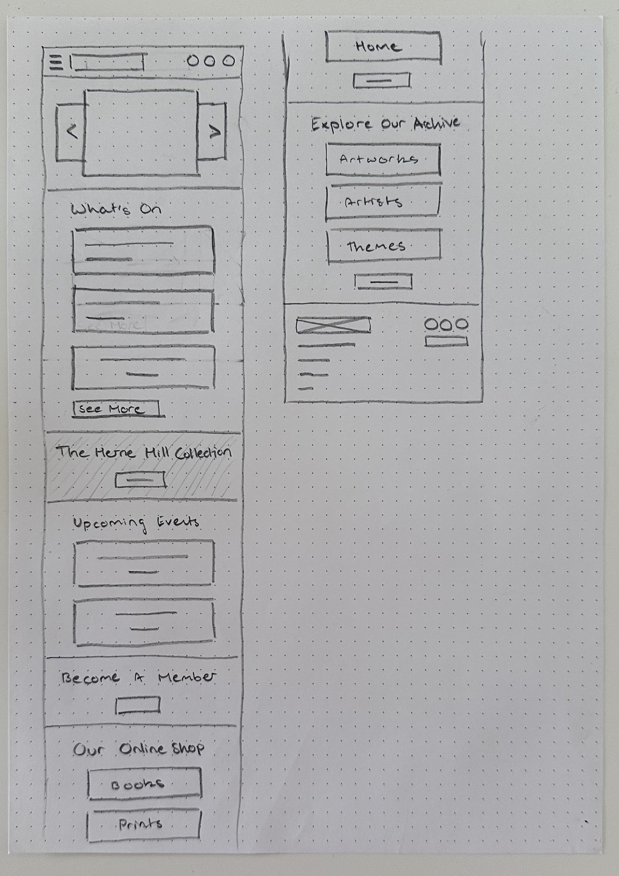
Referring to my research as well as my previous app design, I made a list of all the features I wanted to include in the website. I then experimented with different ways to organise these pages to determine the most intuitive one for my sitemap.
Finalised sitemap

Wireframes
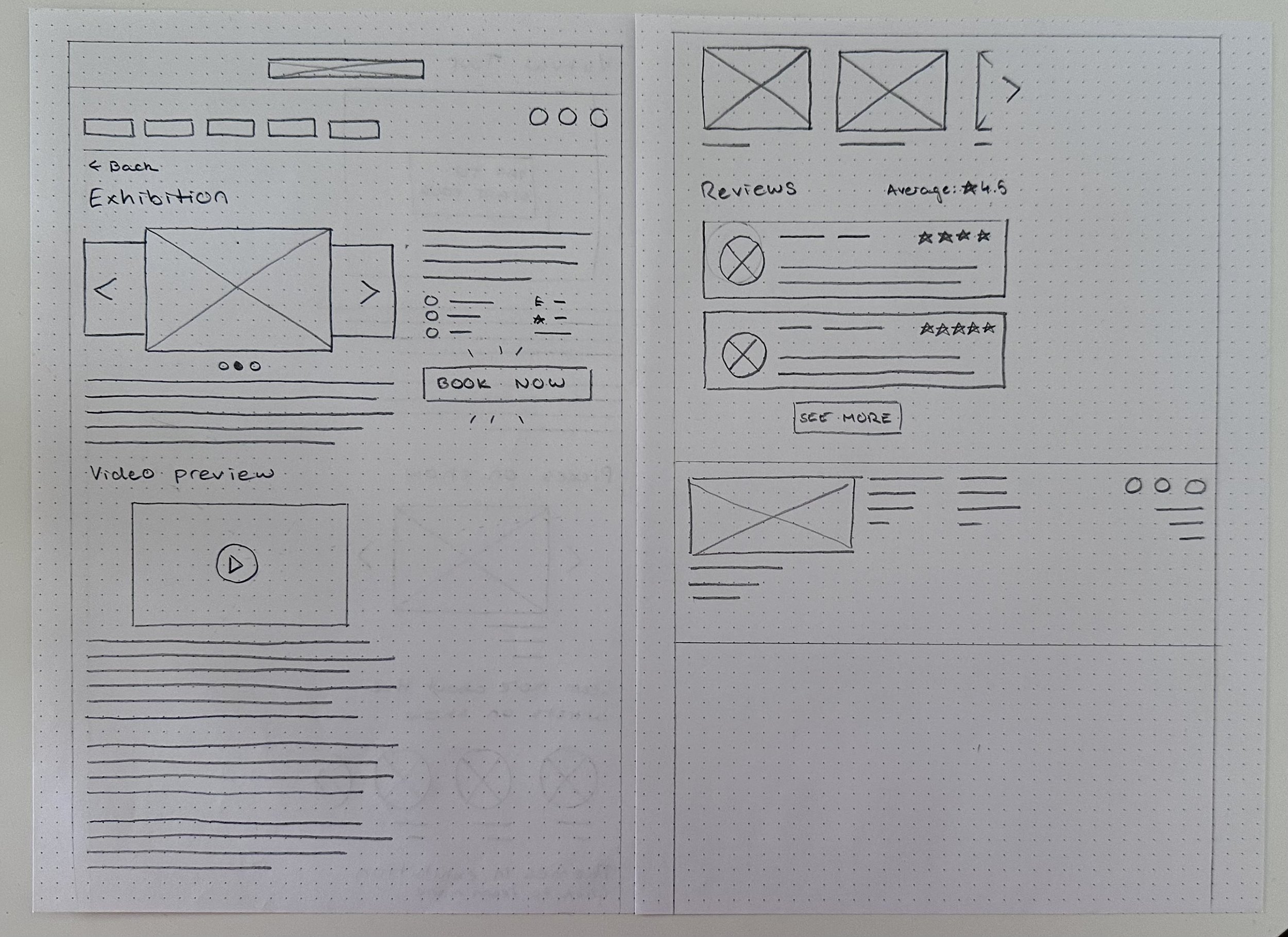
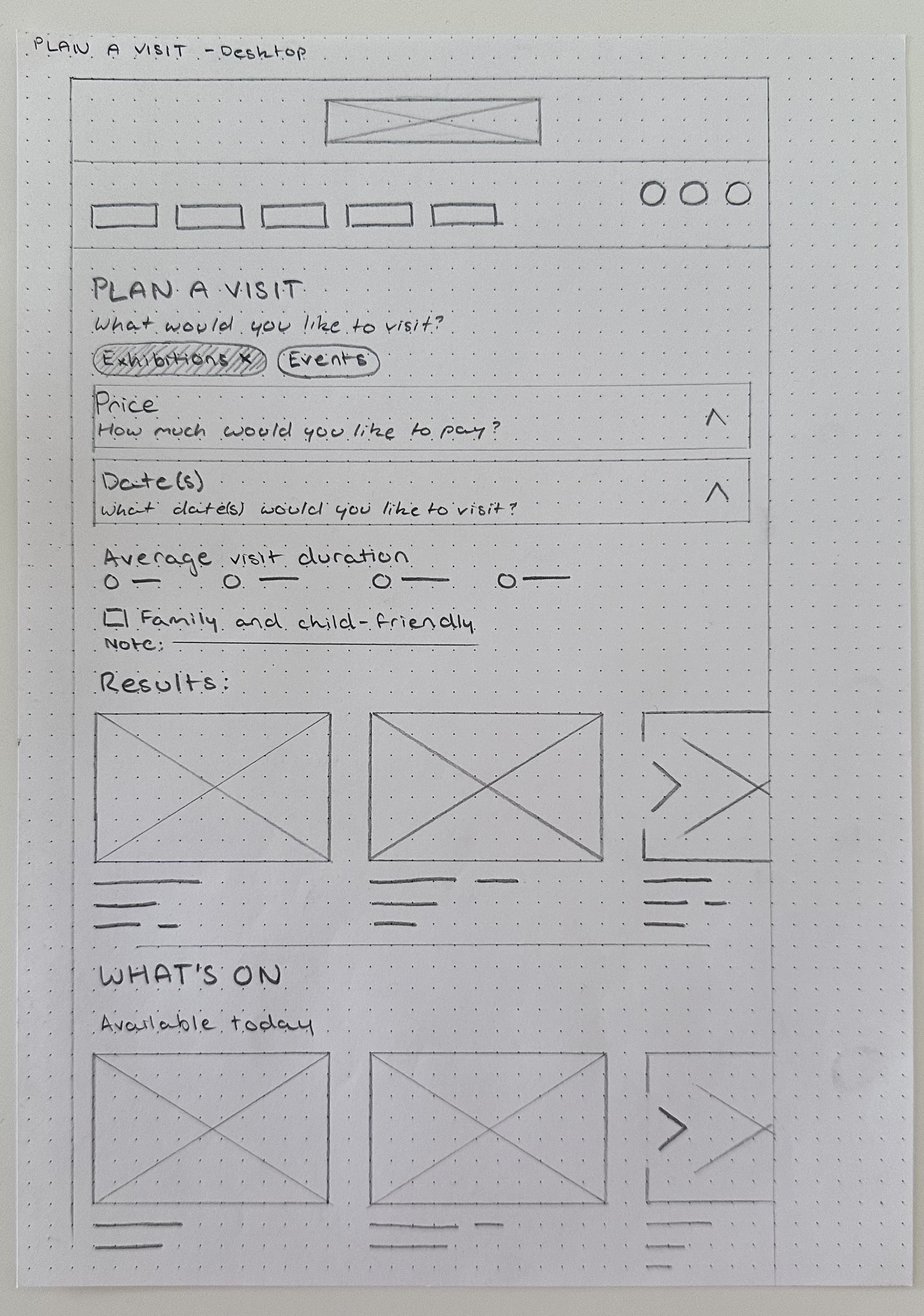
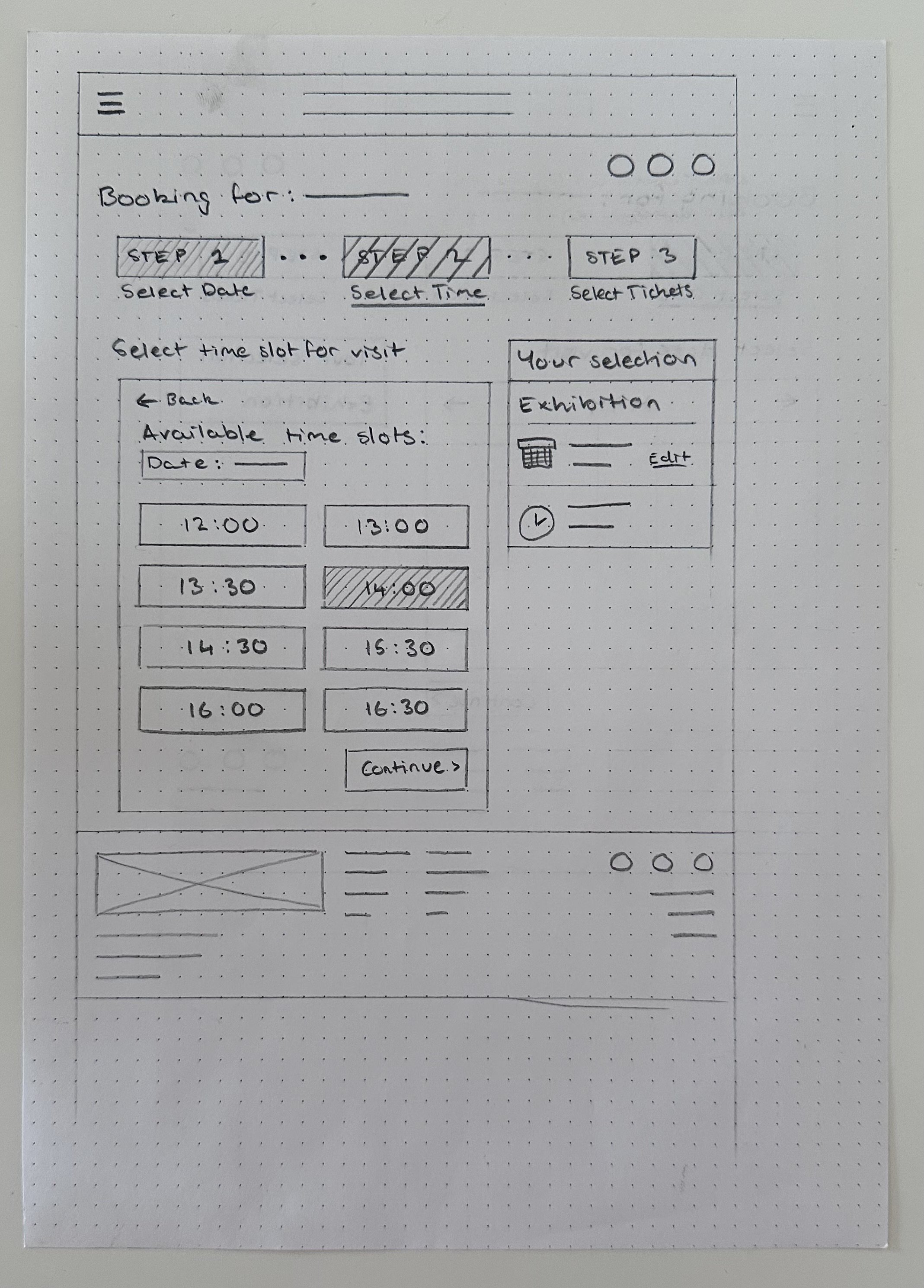
I created paper wireframes to incorporate all the features in my sitemap and visualise the user flows for booking tickets and using the Plan a Visit page. Wireframes were created for desktop, tablet and mobile screens.
Personal reflection
Something which I struggled with during this stage was designing for different screen sizes whilst trying to maintain consistency across all designs. Due to this, the initial wireframing stage took much longer than anticipated which was discouraging at times, however, looking back I realise it was a crucial learning process for me to familiarise myself with designing for different screens and ensuring my designs can be adaptable
I spent some time redoing and refining the paper wireframes. These were then recreated on Figma and I added interactions to create my low-fidelity prototype.
Digital wireframes for the homepage and the Plan a Visit page


usability tests - round 1
After completing my low-fidelity prototype, I decided on the specific flows to test in my first round of usability testing.
My goals for this usability test were:
Compare ease of use across different screen sizes for specific flows to determine consistency
Identify any issues with the usability and intuitiveness of the booking flow and the Plan a Visit page
I presented my usability test as a Google Form and posted it on the Coursera forum online for my course to recruit more participants. You can access the usability test and the accompanying prototypes here.
Main findings:
Generally speaking, participants did not find one screen size particularly difficult or confusing. Some expressed that certain pages on the mobile screen were more ‘crowded’ but that this did not interfere significantly with completing tasks
For some of the desktop screens (in particular the exhibition page), participants felt the content was not well balanced across the screen and was ‘unappealing’
iterations - round 1
Incorporating a browser address bar
Towards the end of finishing my low-fidelity prototype, I realised I had forgotten to incorporate a browser address bar. I added one to the mobile prototype which participants tested in my first usability test and reported no problems with in terms of space and crowding. Adding this browser address bar to all the screens was the first iteration I completed.
Changes to the size and format of certain features
After incorporating a browser address bar on all the screens, I also slightly altered the format of some of the screens, mainly changing the sizes of elements. Particularly on the desktop screens, I made the text and images smaller.
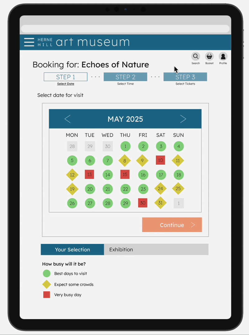
Lastly, I also redesigned the calendar, representing each date with a colour and a specific shape to indicate busyness. I decided to add the shape element to improve accessibility and make the dates stand out from each other more.
New design for calendar on a tablet screen

Adding colour and images
To gather feedback on my colour choices, I added colour to my prototype. While I initially planned to reuse the colour palette from my first project, I updated the accent colour from a light orange (#FFBD80) to a darker shade (#EA672E). The new colour offered better contrast, making it more versatile and compliant with WCAG accessibility standards whilst also maintaining the fun and creative style of my museum's brand. All the artwork images were free-to-download, public domain images from the websites of the Art Institute of Chicago (https://www.artic.edu/) and the Metropolitan Museum of Art (https://www.metmuseum.org/) .

Revised colour palette

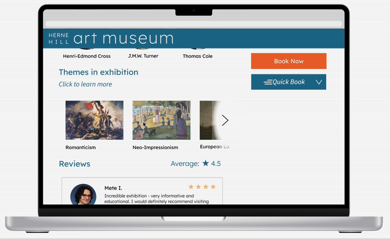
‘Quick Book’ feature
One participant reported that the exhibition page on the desktop screen was 'too heavy' on the left side. In response to this, I changed the format to be more balanced (as previously mentioned) but I also had an idea for a new feature I could add to accompany the 'Book Now' button. The 'Quick Book' feature could allow visitors to quickly add tickets to their basket if they did not particularly care for extra information on busyness of certain dates and wanted a faster route to checkout. I was unsure about how useful this would be and whether its purpose would be confusing, particularly as it was placed next to the regular 'Book Now' button which leads users to the booking flow. I decided to implement it into the prototype to hear what potential users may think of it.
Original exhibition page design without the Quick Book feature

Exhibition page after adding Quick Book feature

usability test and iterations - round 2
At this point, I had a high-fidelity prototype ready for a second round of usability testing.
The goals for my second round of usability testing were:
Ensure usability is maintained after colours and images have been incorporated
Explore whether these visual elements assist users in completing tasks and navigating the website
Gather opinions on whether the design is visually appealing or not
Determine whether the ‘Quick Book’ feature would be a valuable addition to the website
You can access the Google Form for the second usability test and the accompanying prototypes here.
Main findings:
Overall, participants expressed positive feelings towards the design, particularly with regard to the colour palette. One mentioned that they wish the accent colour was incorporated more.
Regarding the Quick Book feature, participants did not express any confusion regarding the purpose of the feature and could see themselves using it personally
Based off of my participants’ responses, I experimented with incorporating the accent colour more and decided to include the Quick Book feature in my final design.
final look
Home page, exhibition page and profile page on a desktop screen

User flow for booking tickets on a tablet screen
Plan a Visit page on a mobile screen

Quick Book feature on a desktop screen
reflection
This project marked a significant step in my growth as a UX designer, as it was my first time designing a fully responsive website for multiple screen sizes. It gave me the opportunity to tackle more complex challenges, such as maintaining visual consistency while creating adaptable layouts.
The testing stages were particularly valuable, helping me practice how to justify and communicate my design decisions. They also allowed me to evaluate whether my solutions truly improved the user’s experience.
The most important lesson I learned was not to rush the foundational steps of the design process. I spent significantly more time on early-stage paper wireframes than I had in my previous project. At first, the slow pace felt discouraging and it seemed like I wasn’t making visible progress. In hindsight, that early investment helped me catch and resolve issues before they became bigger problems.
Compared to my first project, I noticed far fewer revisions were needed throughout this design, which I attribute to the stronger foundation I laid at the beginning. I’ve come to understand that meaningful progress isn’t measured by speed, but by the intention behind each step - a quick design does not necessarily mean a good design.